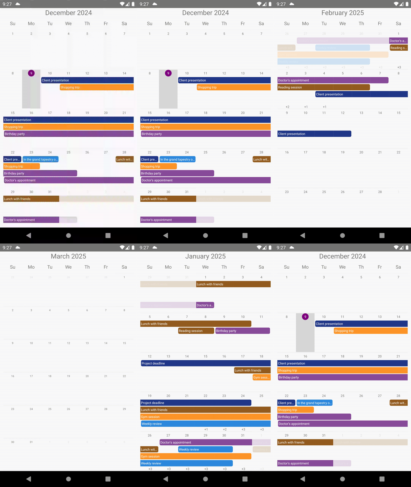
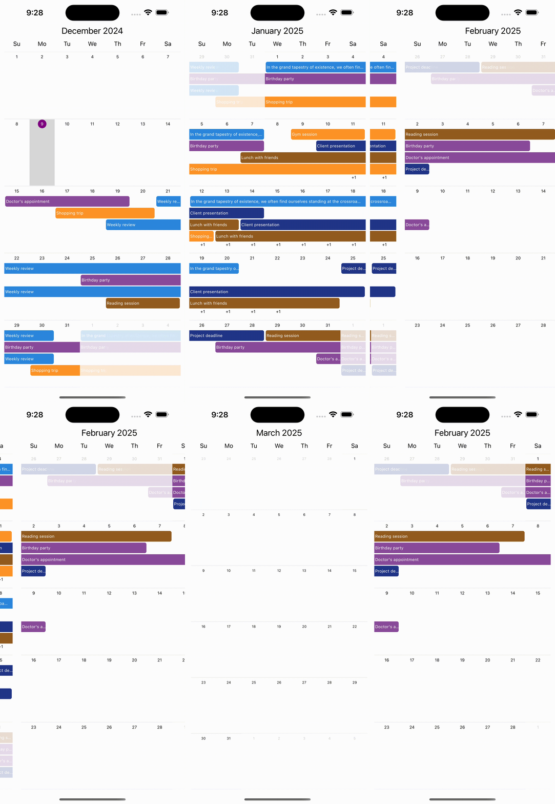
Getting Started
React Native Full Calendar (RNFC)
React Native Full Calendar (RNFC) is an intuitive and powerful calendar component library designed for React Native.


🚀 Features
- Full Monthly Calendar: Displays events on a monthly basis.
- Event Styling: Add multiple events per day with colors and styles.
- Multi-Day Events: Visualize events that span across multiple days (e.g., team meetings, vacations).
- Horizontal Scrolling (Currently Supported): The calendar currently supports horizontal scrolling only.
🔌 Installation
$ npm install react-native-full-calendars
OR
$ yarn add react-native-full-calendars
Dependencies
yarn add react-native-reanimated react-native-gesture-handler
Follow installation instructions for react-native-reanimated and react-native-gesture-handler
Basic Usage
import React, { useCallback, useState } from "react";
import { Dimensions, SafeAreaView } from "react-native";
import { GestureHandlerRootView } from "react-native-gesture-handler";
import Calendar from "react-native-full-calendars";
import { mockData } from "./test";

function App(): React.JSX.Element {
  const [selectedDate, setSelectedDate] = useState<Date>(new Date());

  const handlePress = useCallback((date: Date) => {
    setSelectedDate(date);
  }, []);

  return (
    <GestureHandlerRootView>
      <SafeAreaView style={{ flex: 1 }}>
        <Calendar
          selectedDate={selectedDate}
          onPageChange={(date) => {
            console.log(date);
          }}
          data={mockData}
          onDatePress={handlePress}
          width={Dimensions.get("window").width - 20}
        />
      </SafeAreaView>
    </GestureHandlerRootView>
  );
}

export default App;
Properties
| Property | Type | Default value | Description |
|---|---|---|---|
data | CalendarData[] | The data displayed in the calendar, including events | |
ref? | Ref<CalendarController> | null | A reference to the CalendarController instance, allowing external control or state inspection of the calendar. |
selectedDate? | Date | The currently selected date in the calendar. | |
currentDate? | Date | new Date() | The date considered as the current day in the calendar. |
onDatePress? | (Date, DateOptions) => void | Callback triggered when a date is pressed. | |
onPageChange? | (Date) => void | Callback triggered when the calendar page changes. | |
buffer? | number | 1 | Number of additional pages to load before and after the current page. If buffer is 2, the calendar loads 2 pages before and 2 pages after the current page. |
maxDate? | Date | The latest date the user can navigate to in the calendar. | |
minDate? | Date | The earliest date the user can navigate to in the calendar. | |
maxVisibleCount? | number | 4 | The maximum number of items visible within a single date component. |
height? | number | The height of the calendar component. | |
width? | number | The width of the calendar component. | |
theme? | Theme | Theme settings for customizing the calendar's appearance. | |
weekStartDay? | WeekDayIndex | 0 (Sunday) | The first day of the week. |
renderDate? | RenderDate | Function to render the content of a single day in the calendar. | |
renderDayLabel? | RenderDayLabel | Function to render the labels for days in the calendar (e.g., Mon, Tue). | |
renderHeader? | RenderHeader | Function to render the header of the calendar. | |
renderMoreItemText? | RenderMoreItemText | Function to render text indicating the number of additional items beyond the visible count. |